
IN2 Fitness · Mobile product design
Less friction.
More movement.
From finding your club to showing up for your next session. One connected member experience.
Product design / UX / Mobile experience
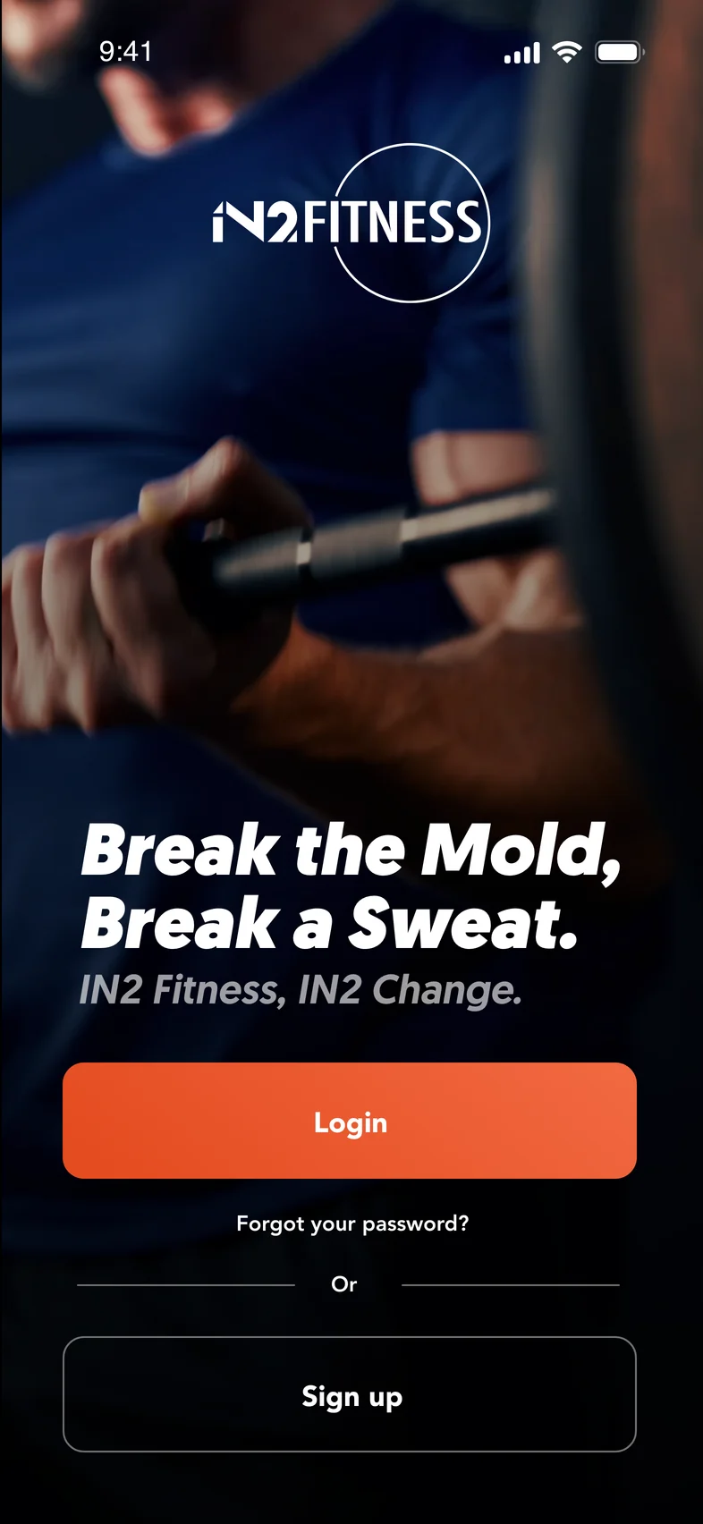
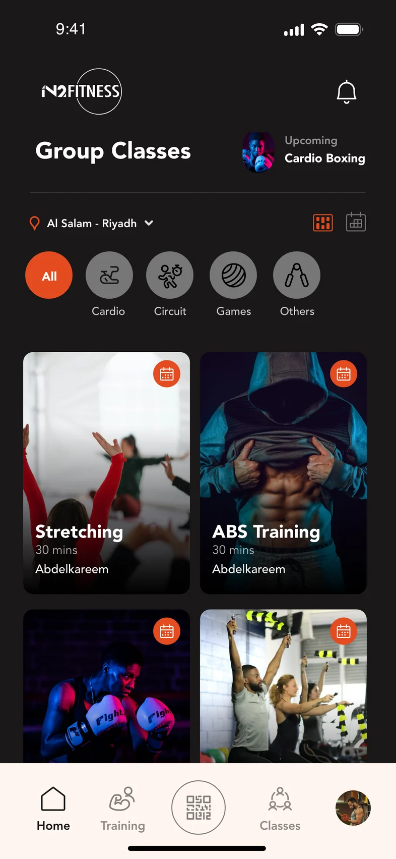
The challenge
Joining is one decision.
Coming back is many.
Choosing a club, buying a membership, booking a class and finding a trainer should feel like parts of the same journey, not separate tasks to figure out.
The design connects those decisions, keeping the next action clear and the details close at hand.
01 / Joining
Big commitment.
Small, clear steps.
Location before membership. The setup follows the order of a real decision: where will I train, and what works for me?
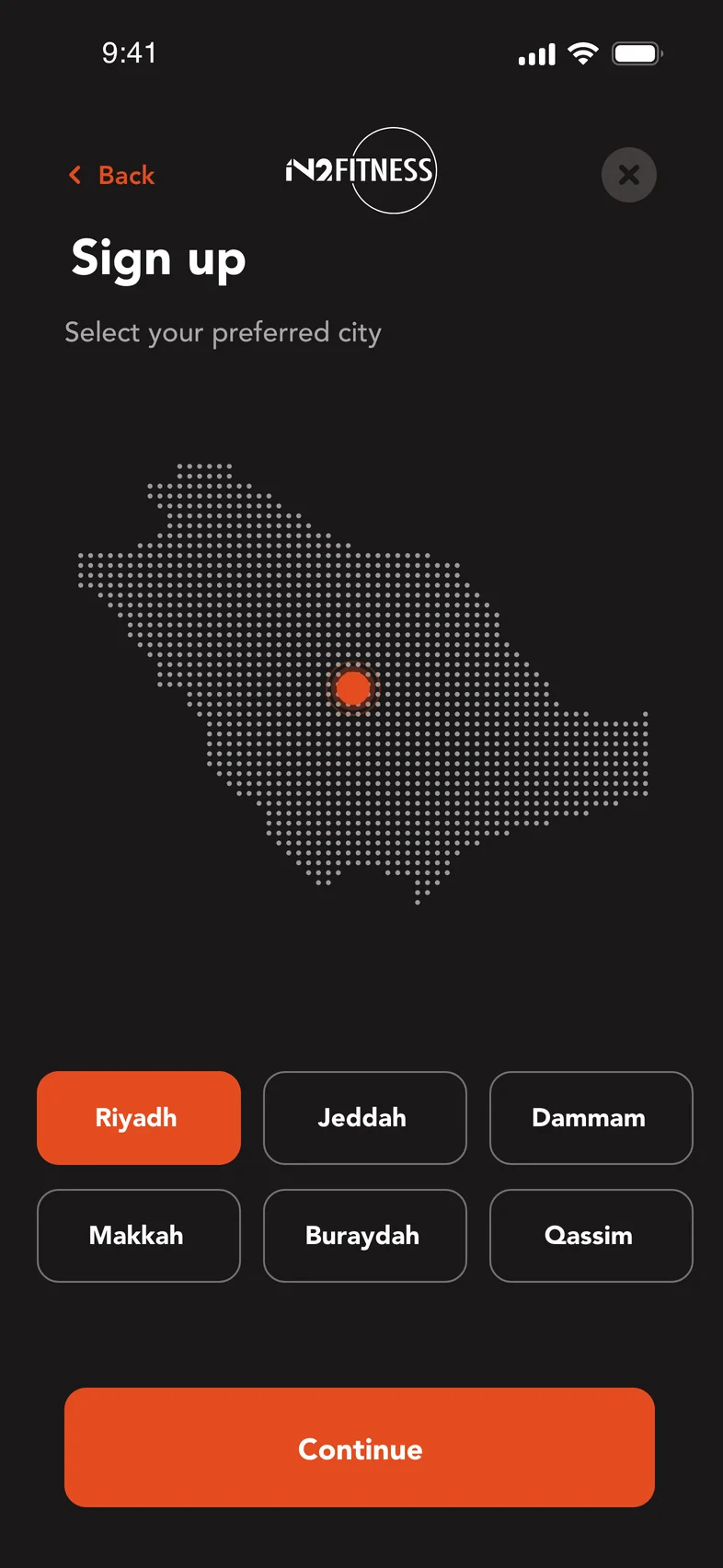
Start close to home.
City first. Relevant clubs next.
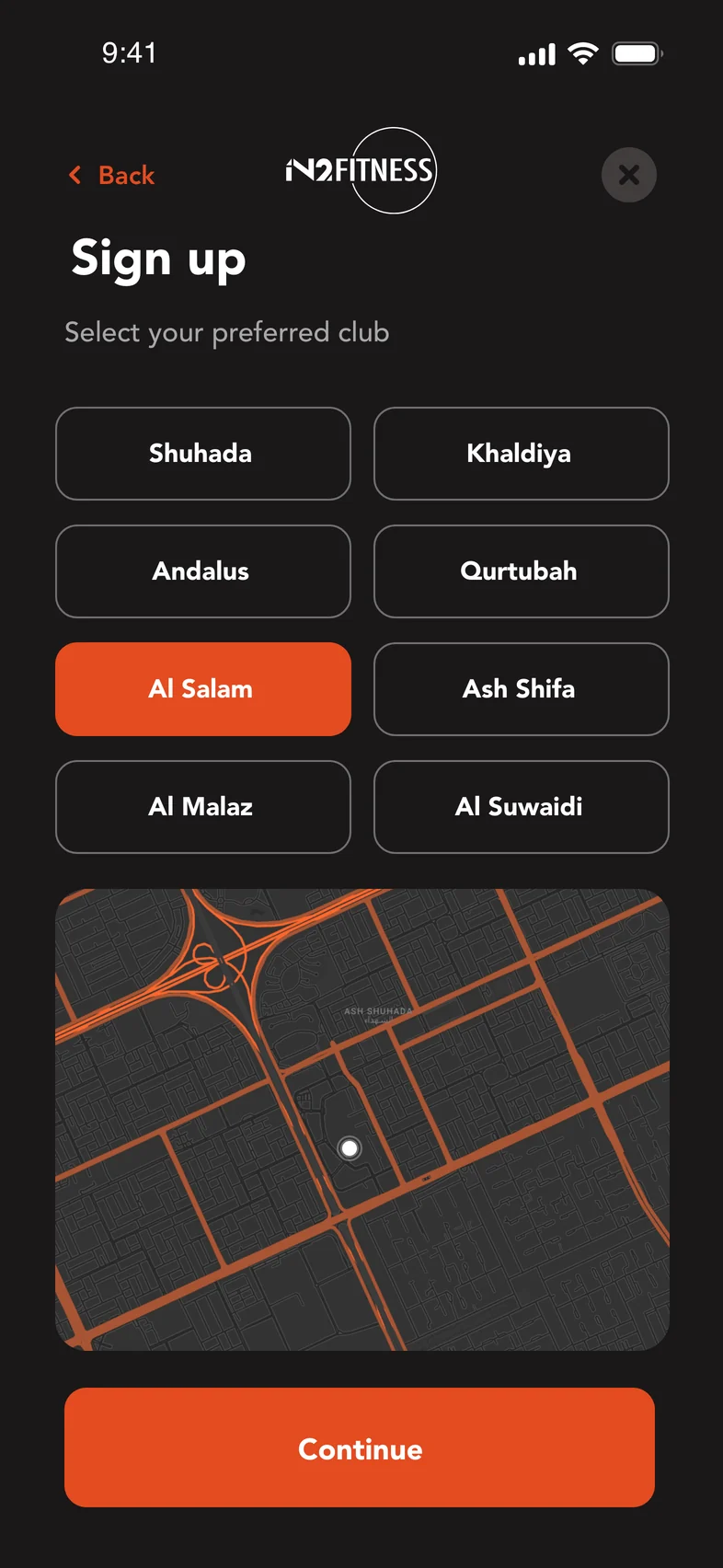
Give the choice context.
A club name, grounded on a map.
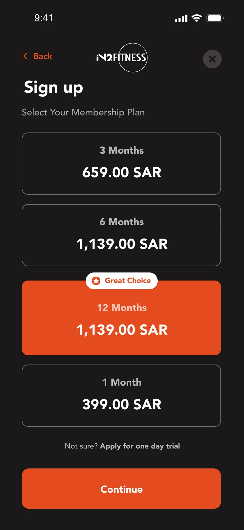
Make the commitment clear.
Duration and price, considered together.
1 / 3
02 / Booking
From “I should”
to “I’m booked.”
Availability makes the choice concrete. Confirmation removes doubt. Upcoming bookings keep the next session visible.
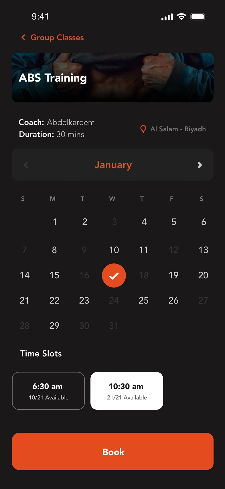
Find your moment.
Date, time and availability in one view.
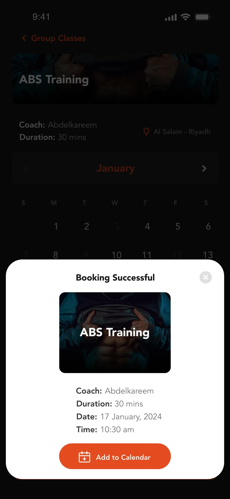
Close the loop.
A confirmation that can join your calendar.
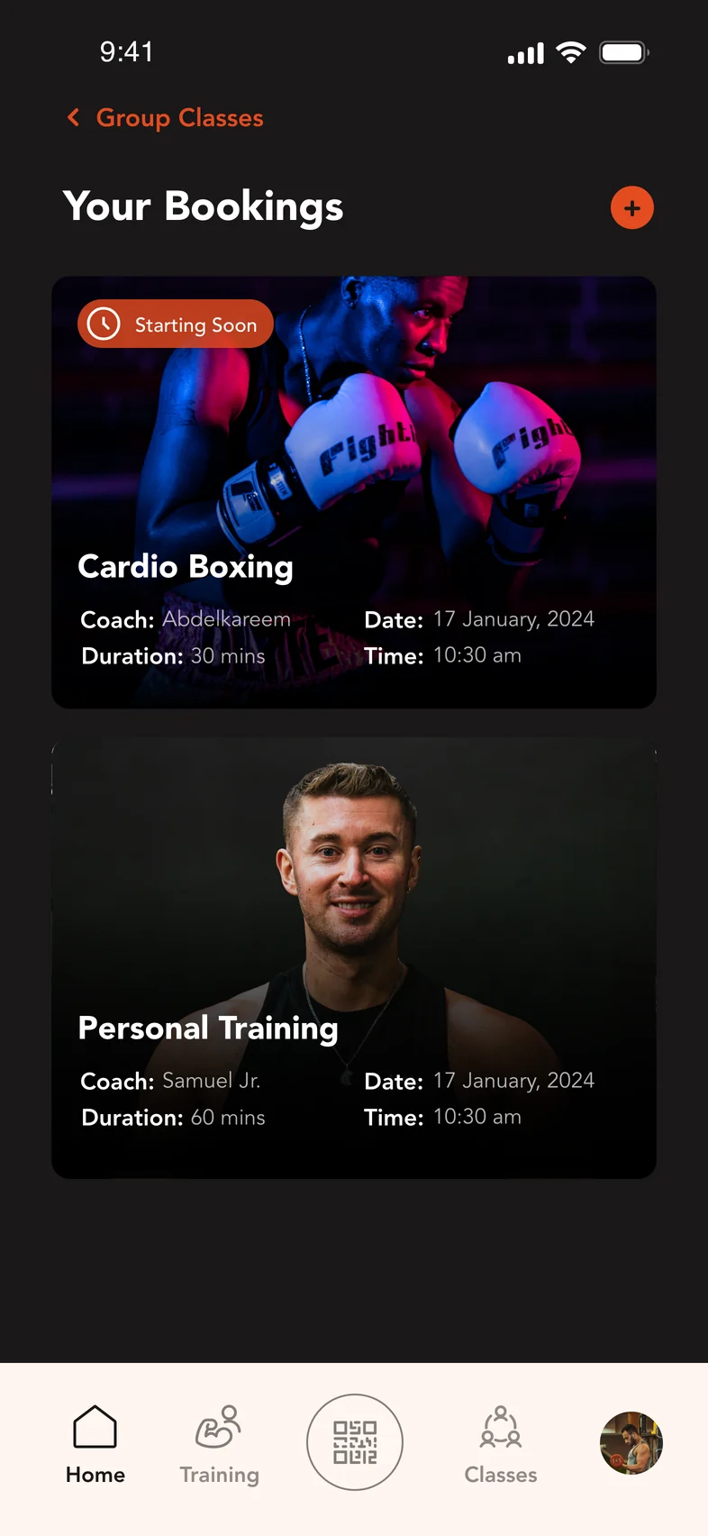
Keep what’s next in sight.
Classes and personal training, together.
1 / 3
03 / Personal training
A person.
Not just a package.
Start with the coach and their expertise. Then connect the choice to session credits and payment without losing the context.
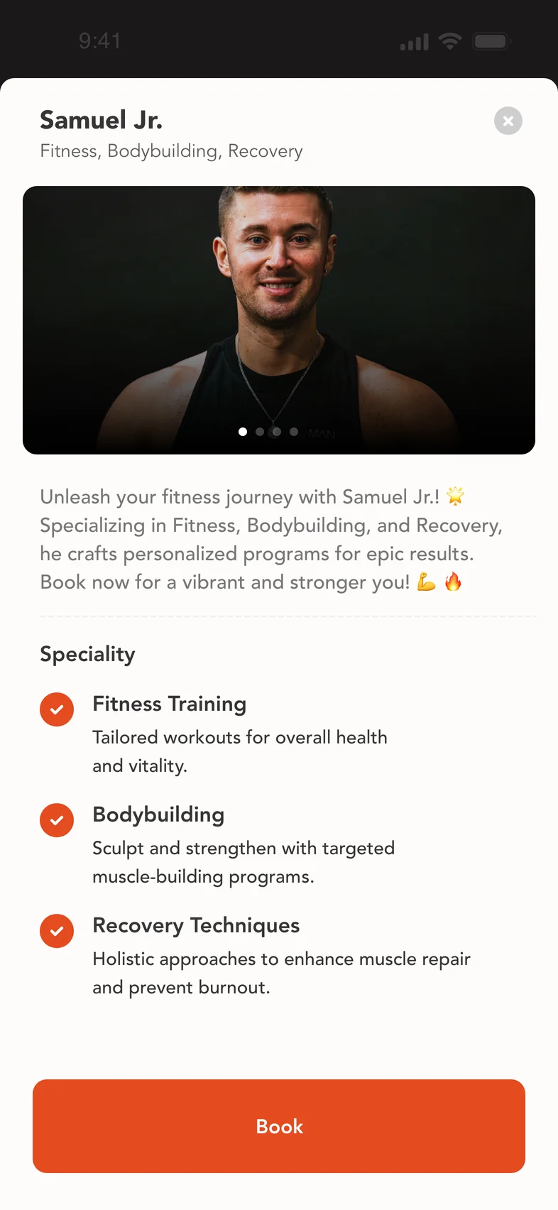
Choose the person.
Specialisms before the booking decision.
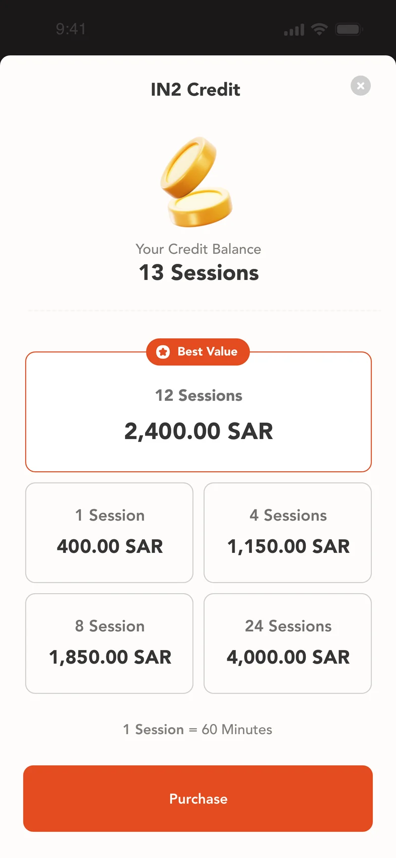
Understand the value.
Session balance beside package options.
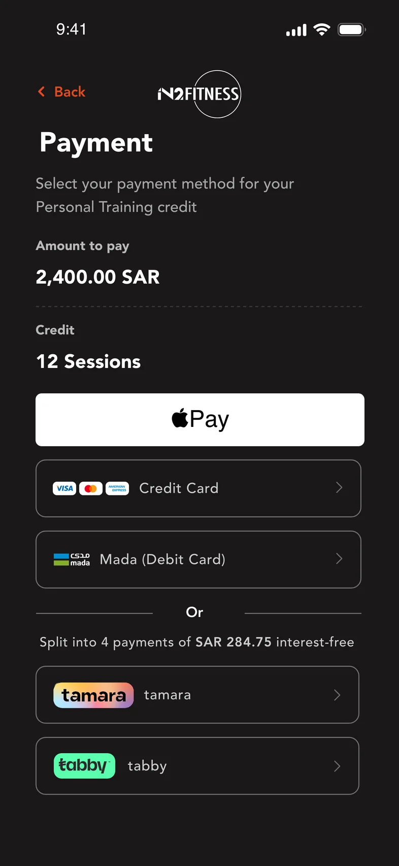
Choose how to pay.
Familiar payment methods. A visible total.
1 / 3
04 / Showing up
The journey doesn’t
end at “Book.”
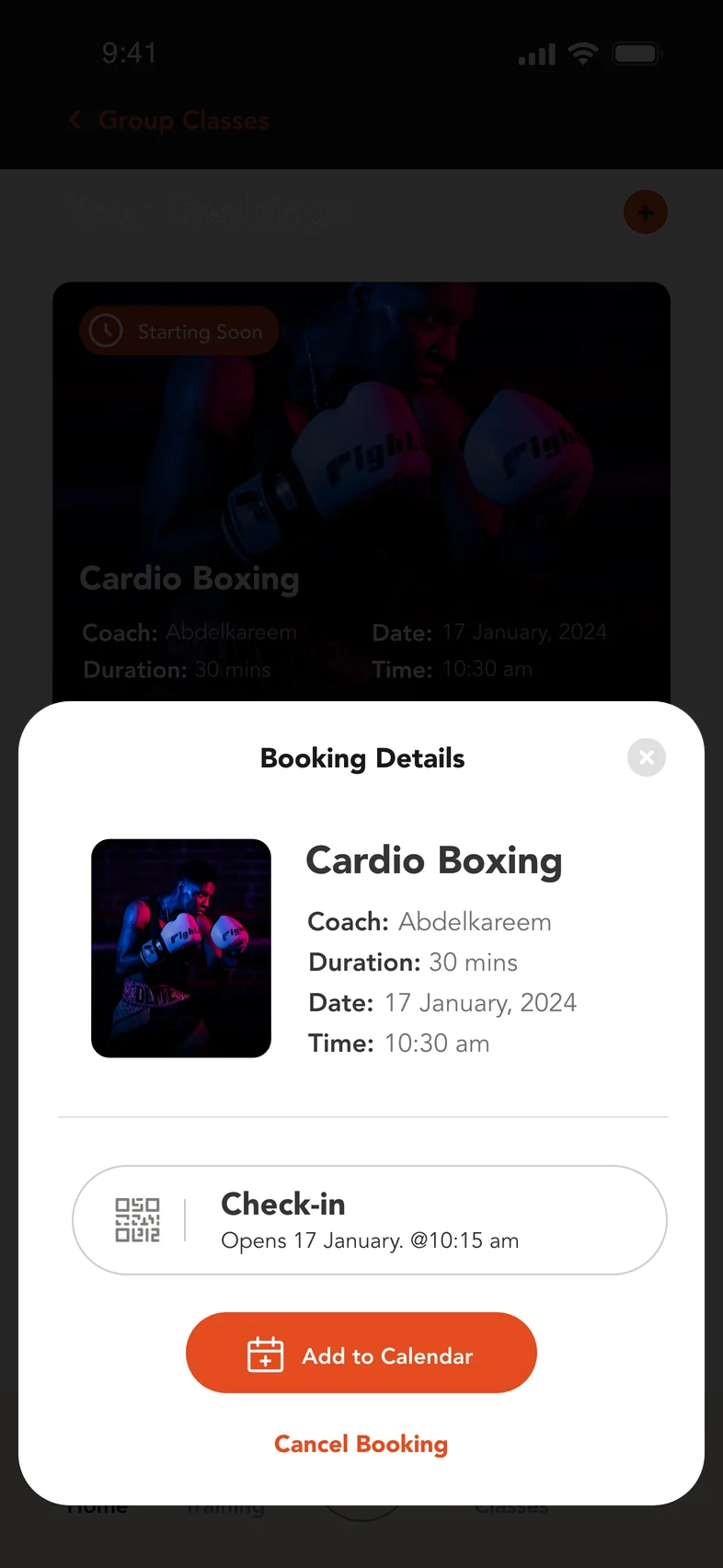
The member still needs to arrive. Session details, calendar access and the check-in opening time stay together in one place.
Show when check-in opens, not just an unavailable action.
The principle behind the product
Less to organise.
More to show up for.